Qualatative information- relating to categories or qualities.
Quantitative information- measures of counts expressed as numbers
Quantitative information- measures of counts expressed as numbers
Pie Charts
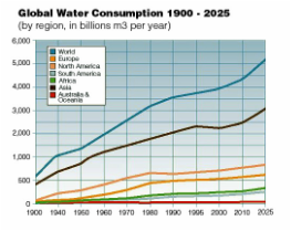
Line Graphs & Bar Draphs
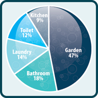
- Useful for displaying qualitative information
- Showing different proportions of each category- add up to 100%
- Not good for over 6 catergories- difficult to interpret
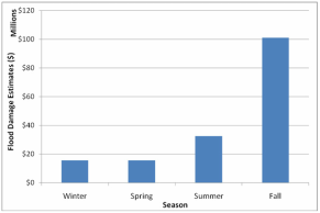
Line Graphs & Bar Draphs
- Interchangable much of the time
- Line graphs (left) often work best with continuous quantitavive data (ongoing time) as it is easier to identify spikes and drops
- Line graphs are better for more data and bar graphs for less data
- Bar graphs work well with both qualitative and quantitavie data as it is easy to count the number of categories
|
|
Activity
Choose a chart/graph to present the following info-
Average monthly distrubution World Energy Production
of thunderstorms in Darwin- Hydro-Electricity- 6%
Jan-17.5 Gas- 24%
Feb-15 Oil- 35%
Mar-13 Coal- 29%
Apr-4.5 Nuclear-6%
May-1
June-0
July-0
Aug-0.5
Sep-1
Oct-6.5
Nov-15.5
Dec-17
Choose a chart/graph to present the following info-
Average monthly distrubution World Energy Production
of thunderstorms in Darwin- Hydro-Electricity- 6%
Jan-17.5 Gas- 24%
Feb-15 Oil- 35%
Mar-13 Coal- 29%
Apr-4.5 Nuclear-6%
May-1
June-0
July-0
Aug-0.5
Sep-1
Oct-6.5
Nov-15.5
Dec-17
